Sign-up forms, whether simple or complicated, are ubiquitous. You are either the one who develops or fills out the forms. From SaaS to e-commerce and media platforms, there is no getting past them. As a result, they are now a regular part of our digital life.
Because customers are used to filling out sign-up forms, even little errors in design or the information requested can significantly impact conversions.
How can a website design company verify that their forms are filled out? It is critical to provide value to customers in exchange for their contact information, and your sign-up form must correspond to the content provided or the promised outcome.
Signing up is frequently a user's first engagement with your product. This initial encounter is critical in creating your product's brand and setting the tone for their whole experience with the product. To maintain a consistent user experience from the start, make your sign-up screen as simple and user-friendly as feasible.
This article will discuss the 10 Best Practices for Creating Powerful Sign-up Forms for e-commerce websites.
What is a sign-up form?
A sign-up form is a webpage, questionnaire, document, or popup that visitors must fill out with personal information to access certain content or subscribe to a service.

Sign-up forms can serve several functions, but they all have one thing in common: they collect personal consumer information, such as their email address and name, in return for access to high-quality information or services.
For many sites, sign-up forms may also be the entry point to all possible conversions. This is especially true for freemium or subscription-based businesses.
E-commerce websites also rely significantly on these forms because they are a required step before making any transaction.
Why are sign-up forms important for e-commerce websites?
Conversions take place on sign-up forms. In other words, sign-up forms generate revenue.
Forms are how website design companies may get up personal and close with their potential clients in our digital age. This is where they gather emails, basic user information, and leads and send content at the start of their engagements.

To summarise, forms are at the heart of many digital interactions:
- Forms are where purchases are made in the e-commerce business.
- Forms are where leads are generated in the service business.
- Forms are where clients are acquired in the SaaS sector.
- As you can see, sign-up forms are the primary component of the puzzle.
Knowing this, it's no wonder that ignoring forms harms any website design company. A single mistake may cost a substantial firm millions of dollars in lost revenue.
Expedia, for example, discovered that adding one more line to their registration form cost them more than $12 million per year, as determined by analytics after rectification.
First, your team must run A/B tests on your sign-up forms to determine which are the most enticing to your users.
An example of an A/B testing program is AB Tasty, which allows you to quickly test components of your sign-up form or other parts of your web page. With AB Tasty's low-code solution, you can quickly run these tests, receive data through an ROI dashboard, and start optimizing conversions.
10 Best Practices for Creating Powerful Sign-up Forms:
1. Make it evident and contextual
Your forms serve only one purpose: to be filled out by visitors. For this reason alone, ensure your forms are identifiable on your website and use unique colors.

However, remember that just because your sign-up forms are visible doesn't imply they should be displayed everywhere. When requesting personal information from your visitors, context is everything.
Let's look at Lever in the example below. Lever provides gated material on particular HR topics that require you to register. It employs a clear call-to-action and provides a quick synopsis to assist them in "selling" their material before visitors enter their personal information.
2. Keep the sign-up form as short as possible.
The more fields there are on sign-up forms, the less likely a person is to complete the form. In one case, fewer fields resulted in a 120% conversion boost. When a user registers, try not to ask for too much information. Life needs to be longer to save time filling out forms. Instead, only ask for necessary information. As part of the certification process, many websites or apps may request a large amount of information. To reduce friction, the finest sign-up forms are always transparent and straightforward. Your form should ideally ask for information necessary to register the customer in your database, such as their email address, name, and password.

Depending on your website design company, you may need to collect extra information but keep the form as short and straightforward as possible to boost conversion rates. Also, it's better to save your users the trouble of creating a username for your website.
3. Use a Brilliant Design
Your form's design should be practical, attractive, and memorable. As a result, these are the three most sought-after keywords for businesses when it comes to design, whether to create a logo, set up a website, or create visual content like animations and infographics.
Unique and eye-catching designs will always positively impact your conversions since they say volumes about your business and leave a longer-lasting impression.
4. Split up the registration process.
Keep your form basic and easy to fill out. Give the user an option, and the user will be able to establish an account swiftly and efficiently. Why waste time filling out long forms when you can register with only a few mouse clicks? First, you should avoid adding unnecessary controls to the registration process by focusing solely on the relevant information. Consumers today do not anticipate excessively complicated login forms that are both confusing and time-consuming.

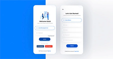
The ideal sign-up page design provides consumers with many sign-up alternatives so that they are not irritated and have the option to select.
5. Follow Privacy Regulation
Including a privacy policy in your email forms is not a great conversion booster, but it is essential. Consumers are becoming increasingly worried about their security and privacy. Therefore, you must account for this or risk losing conversions.
Some regulatory organizations regulate how internet companies manage and interact with their customers' data. In addition, organizations like the CASL, GDPR, and CAN-SPAM protect American and European people from privacy abuses.
It would help if you got acquainted with the bodies' regulations that apply to your online audience and jurisdiction.
6. Don't ask for password confirmation.
The Confirm Password form assists customers in avoiding the possibility of misreading their password while signing up for the program. However, it lowers the sign-up form conversion rate.
There are various phases to the procedure. Entering a password the first time and then again if it does not match will result in a system error. They should erase both passwords and retype them blindly. The procedure might be repeated several times, creating user dissatisfaction.
A better and more effective method is to include a Show Password option alongside the Password field. Users may select the choice, view the password they are entering, and make immediate modifications if necessary.
7. Include social proofs
Social proofs assist you in marketing your products and services because they tap into our deeply ingrained social nature.

Showing your visitors that many others have done the same thing before them offers them confidence in your product or service. This also boosts your website design company's trust and helps you reach excellent conversion rates.
There are around 2.6 billion social media users nowadays. You may make account registration and log in more accessible and enjoyable by allowing users to join up on your app/website using their external accounts, such as social network accounts.
It's all about persuading your visitors to take the following step. In the example below, Slack employs social proof by displaying client testimonials from well-known website design companies just above their sign-up form.
According to Cruip's study, a firm foundation is which social media networks are the most popular to join up for. According to their data, people choose Google (70.97%), Facebook (19.69%), and Twitter (9.32%).
8. Avoid Irritating Users
You must be thoughtful and cautious with your opt-in technique so that your attempt to acquire a subscriber does not inconvenience them and turn them into a bounce or abandonment statistic.
You can use various scheduling criteria to make your sign-up form appear at the proper time that works well for e-commerce companies.
- Making it appear as part of the checkout process.
- Making the form display promptly aids the user's visit to the site. This is especially popular with first-time visitors since you may give them a discount on their first purchase.
- Making it appear when it appears they are going to abandon the site. This is sometimes referred to as an exit-intent popup.
- Making it appear after they've visited your site multiple times without subscribing or purchasing. This also applies if you employ a guest checkout method and do not ask customers to register an account and provide their email before checking out.
- Making it appear as if they spent a particular amount of time on your website without taking action.
- Making it look when they are going to leave a cart. This will help your cart abandonment approach.
- Making it appear after they've clicked on an element, such as a floating symbol or a CTA.
9. Use different terms for "sign in" and "sign up"
Place the phrases "sign up" and "sign in" side by side to avoid confusing users. Because they are so similar, there frequently needs clarity regarding which to use and when. Use various titles for each page so customers can easily differentiate between the activities. For example, instead of "Sign In," use "Login." Consider using a different phrase, such as "register," or lengthier words, such as "create an account." This makes it clear that each step is separate and must be done to continue using your product: sign in first, then sign up.

A good form begins with a title, and a good design begins with text. Short and clever CTA offers visitors the benefits of completing this form while motivating them. Offering an offer is an excellent method to get people to sign up. According to research, offering an incentive can raise your sign-up conversion rate by up to 15%. Instead of just asking the user to join, incentivize them to give you their email address. These incentives might be anything you believe the user would find helpful.
10. Optimize and test your sign-up forms
Putting best practices into action is a good practice in and of itself. But assessing the changes and their benefits is much better.
Do three fields outperform six? Is it worthwhile to adopt a social media sign-up? Is social proof truly motivating visitors to fill out your form? The only way to find out is to keep track of your sign-up form experiments.
Your marketing staff should test several versions. You will be able to:
- Measure your conversion gains at each level.
- Make assumptions based on your analytics.
- Find a winner by testing various versions.
Do you want to start A/B testing for your website? AB Tasty is an excellent example of an A/B testing tool that allows you to set up A/B tests with little code implementation of UX or front-end changes to sign-up forms on your websites, collect data via an ROI dashboard, and discover which path will increase your income.
Conclusion
We have provided you with the best practices for creating powerful sign-up forms for e-commerce in this post. However, you must constantly pay attention to fit your demands depending on your audience and project goals.


