Web design is responsible for nearly 95% of a visitor's first impression of your business, and good design can help you increase sales.
Website design and development have been relatively simple since their inception. The evolution of web technologies has made it easier to create websites quickly, depending on project requirements. As a result, billions of people access the Internet daily via mobile devices. In this guide, we will look at ten different types and trends in Milwaukee website design that have been shown to help businesses succeed. Each design type adds a distinct flavour to the digital table, ranging from sleek minimalist layouts to immersive storytelling experiences.
10 Types of Website Design:
Web designers must balance creative design elements with practical functionality to create a compelling and user-friendly online presence. These are the nine most popular website layouts 2024 for creating an impactful brand image for your business.
Static Page Web Design
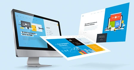
It refers to the static and unchanging display of content on a web page. Unlike dynamic layouts, which can change depending on user interactions or data inputs, static layouts have a consistent structure and appearance. Each page has a predetermined arrangement of elements, such as text, images, and other design components, which remains constant regardless of user actions.
Static layouts are frequently used for simple websites or pages that don't require frequent updates or user-generated content. To use a static page layout effectively, designers should plan ahead of time for the content hierarchy, visual aesthetics, and user experience, as these elements will not change.
Liquid Design Layout
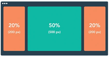
Also known as fluid design, this website layout uses flexible units, such as percentages for width, rather than fixed units to create a fluid style and layout that adapts to different screen sizes or devices.
In addition to the website design elements, this site layout allows the content to expand or shrink in size as needed, regardless of where it is viewed. Despite the importance of ensuring that your website adapts to different resolutions, liquid design layouts have become less popular among many organizations.
Dynamic Website Layout
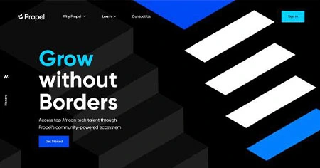
A dynamic layout is a type of Milwaukee website design that relies solely on preferences, real-time data, or user interactions. Unlike static layouts, which remain constant, dynamic layouts enable personalized and interactive user experiences. This method frequently uses scripting languages like JavaScript to change content, update visuals, or load new information without requiring a complete page refresh.
Dynamic layouts are commonly used on websites with frequently changing or user-generated content, such as social media platforms, news websites, and e-commerce sites.
Adaptive Web Design
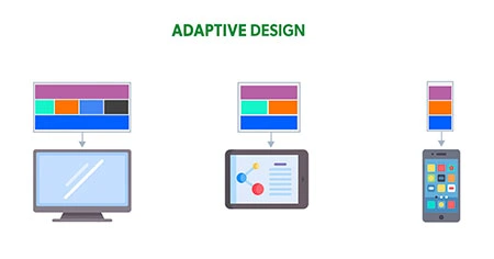
As the name implies, adaptive website design creates layouts that tailor the user experience to specific screen sizes.
Adaptive websites, like responsive websites, attempt to detect the screen size and adjust a website's content accordingly. Adaptive web design creates multiple layouts for different devices (e.g., 360, 414, 601, 1024) and uses CSS queries to adjust webpage size and settings for optimal user experience across all screen resolutions.
Responsive Design Layout
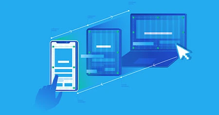
Responsive design, like adaptive or dynamic design, aims to create a flexible user interface that provides an optimal viewing experience across various devices. This technique enables elements on a webpage to be proportionally resized and reorganized, ensuring readability and usability on both desktop and mobile platforms.
Use relative units for sizing, take a mobile-first approach by designing for smaller screens and scaling up, and use media queries to apply styles based on device characteristics.
Freehand Web Design Style
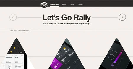
Unlike other website layouts, freehand design embraces a hand-drawn or doodle-like aesthetic. This approach frequently includes elements that appear to have been sketched or drawn by hand, adding a playful and informal touch to the website's visual appeal. Hand-drawn illustrations, handwritten fonts, and other elements that evoke the spontaneity of manual creation are examples of freehand design.
To effectively use the freehand web design style, designers should prioritize maintaining a cohesive and intentional look, balancing the informality of hand-drawn elements with the website's overall purpose and branding.
Single-Page Layout
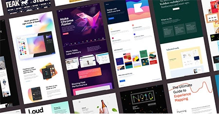
Single-page layout designs are often used. They condense content onto one page, eliminating the need for numerous complex components or user interfaces.
A single-page layout is often simple for users, providing a linear and straightforward structure that streamlines the user experience and eliminates unnecessary distractions.
Realism Web Design Style
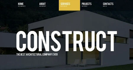
In Milwaukee, website design, realism refers to the appearance and behaviour of physical objects and environments. This design approach uses natural textures, shadows, gradients, and three-dimensional elements to create a realistic and immersive visual experience on the web. This type of graphic and web design frequently prioritizes detailed images and strives to replicate the tangible qualities of objects, making users feel as if they are interacting with physical elements.
To effectively use realism in web design, designers should prioritize high-quality imagery, incorporate subtle animations for a more natural feel, and pay close attention to texture and shading detail. However, it is critical to strike a balance, as overly realistic designs can cause slower loading times and may only be appropriate for certain types of websites.
Fixed design
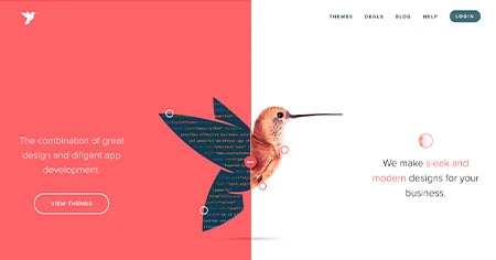
A fixed design allows designers to create a consistent website regardless of window or screen size. The site has a strict resolution and will only display those exact measurements if the user views it on a mobile device or computer monitor. The strict resolution can help designers create a specific website layout that they know will remain consistent on every browsing device. However, users with smaller screens may need help scrolling around the page and finding the required information.
Typography Web Design Style
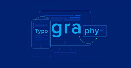
Typography in web design refers to arranging typefaces and text elements to create visual appeal and readable content. It is more than just selecting fonts; it also includes carefully considering font size, line spacing, line length, and the overall layout of text on a website.
The typography web design style emphasizes typefaces as a design element, with fonts used creatively and purposefully to convey the website's personality and improve the overall user experience.
8 Web Design Trends for 2024:
The world of web design is about more than just adapting to change; it's about leading the way to a more immersive, interactive, and intelligent digital future. Understanding (and implementing) these trends enables designers, developers, and brands to create attractive, functional, and user-friendly websites.
Minimalist Web Design
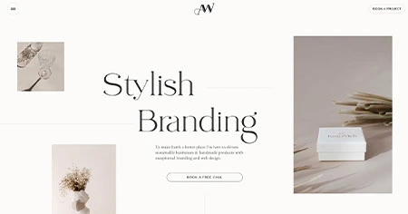
Minimalist web design seeks simplicity by removing all unnecessary website elements, components, and structures that are not essential to the user's tasks. This approach minimizes distractions that may prevent visitors from understanding a website's primary purpose or message.
This involves using clean lines, simple typefaces, white space, and limited color schemes to prioritize the website's minimal design output and improve user focus.
AI-generated designs
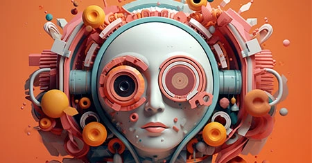
The integration of generative art and AI into web design is set to transform the digital landscape by 2024. AI-generated designs have emerged, become more accessible, and adopted over the last two years, and this trend is expected to continue and transform the digital and design worlds even further in 2024.
The ability to use AI to generate custom graphics based on user data and Milwaukee website design systems opens up new possibilities for personalized user experiences. Instead of providing the same content to all users, sites will now include dynamic and evolving content based on individual preferences, resulting in unique and relevant designs for each user.
Use of 3D Graphics and Claymorphism
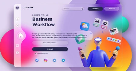
3D visual elements, such as clay morphism, enhance a design's depth, realism, and appeal. This depth can also improve the design's dynamic and interactive qualities, resulting in a more engaging user experience.
This web design trend combines 3D graphics with bright and vivid color schemes, elevating flat designs off the page and creating a spacious, light aesthetic. Advances in technology have made it simpler to incorporate 3D graphics into web and graphic design. Better rendering engines, faster processors, and improved software tools make it easier to create and integrate 3D elements.
Dark Mode
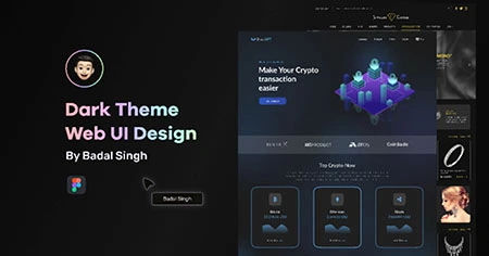
In web design, dark mode is a design choice in which a website or application's background and user interface elements are predominantly displayed in dark colors, such as black or dark gray.
The concept of dark mode in web design has a long history, dating back to the early days of computing. While computers had a dark background by default in the 1970s, technological advancements have made the dark mode a popular design option.
No-code Revolution
As per Gartner's report, the number of no-code and low-code technologies will triple by 2025. No-code technologies are tools and platforms that enable users to build applications, websites, and software solutions without writing traditional code. These tools are intended to be user-friendly and accessible to those with little programming experience, allowing a more comprehensive range of people to participate in the development process.
Micro-Interactions
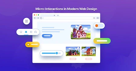
Micro-interactions on websites are small animations that provide users with subtle feedback. One of the most common micro-interactions is to see a link change color when a user mouses over it.
With a focus on micro-interactions, that experience may receive additional attention to stand out. Consider a gradient that gradually shifts hues as you scroll down a page or a burst of color erupting from your mouse after you click an element.
Skeuomorphism
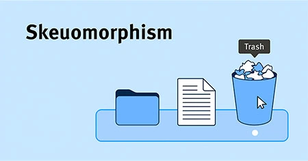
Skeuomorphism in web design refers to creating elements that mimic their real-world counterparts in look, feel, and function. This provides a familiar and intuitive user experience and lets users quickly learn how to interact with various elements, making the interface more user-friendly.
Amplified Accessibility
Accessibility in Milwaukee website design is more than a trend; it is an ethical obligation and a legal requirement in many places. As such, web designers are responsible for creating sites that provide seamless experiences for all types of users.
Designing with accessibility ensures that all users, regardless of disabilities or impairments, can use and perceive digital content. Accessible design and making websites compatible with accessibility plugins that users with disabilities may have installed on their devices help to create seamless online experiences.
Conclusion
As we wrap up the diverse web design types and trends, the opportunities for growing your business in 2024 are both exciting and achievable. The dynamic zone of digital presence necessitates innovation, and the ten design types discussed here provide a road map for success.


