A beautiful site that converts visitors and maximizes the value of each of those hard-earned visits.
This article contains 27 web design tips for getting more value from every visitor. The majority of these hints are backed up by research. These are for beginning designers, advanced UX professionals, and small and large businesses.
Here are the following 27 Research-Backed web Design Tips that Works Perfectly:
1. Seeking attention CTAs
The primary goal of any website design firm is to direct the audience to take specific actions. CTAs are used to increase engagement. You must use appealing colors to direct users' attention to CTAs.

CTA can take many forms:
- Form submission
- Lead generation
- Social sharing Product
- Service discovery
- Sale
- Promotional Event
- Only place some CTAs at the top of the Website's homepage.
- Use a descriptive, key-focused headline near the top of the homepage.
The headline at the top of the homepage (and every page) is either descriptive or not. If not, the visitor may be unable to answer their first question
However, many marketers write something clever or ambiguous instead. However, being clear is preferable to being clever. Rather than a fancy but ambiguous headline, write something descriptive. Explain what the company does near the top of the page, above the fold.
2. Keep it Simple
Continuing with the less theme, this also applies to your overall design. Google conducted a large study that revealed that visitors dislike visual complexity. The gist is that the more complex your web design, the less beautiful visitors perceive it.

What does this mean for your Website? Aside from the preceding point, consider the following:
Rethink the sidebar — Many websites are abandoning the sidebar in favor of a single-column web
design (for example, the one you are on right now). This means fewer distractions and a clear focus on the
content.
Stick to standard layouts — People like familiarity and can be put off by non-standard web designs. As a result, it's a good idea to stick with well-known design tropes and layouts. You can still stand out in other ways.
3. Use People in Photos (But Avoid Stock Photos)
Aside from using them to draw attention, including other people in images on your site is a good idea in general. That is why we have about pages on blogs, for example.
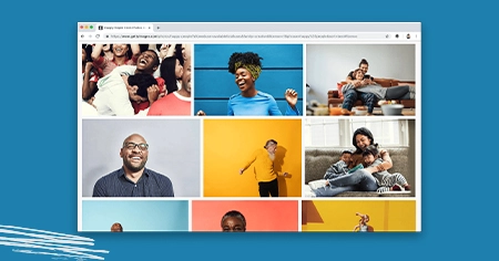
This is demonstrated in one of Basecamp's case studies. However, there is one caveat: stock photos easily negate the entire effect. According to a Nielsen Norman Group study, we are very good at recognizing and tuning out generic images.
As a result, if you use images of people on your site, ensure they're genuine. Involve your employees or customers. Just say no to stock.
5. Rotating sliders and avoiding carousels
They've been popular for years, and customers adore them. However, there is a problem with the homepage slideshow: visitors may only see the first slide. Consider the click-through rates for the slides on a university website. They may be popular because they are simple to obtain.
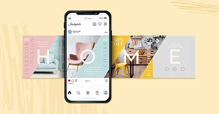
So, what should we do instead?
- Stack the slides so visitors can see them all by scrolling down the page.
- Use a featured image as the hero, with the most impactful slide as the focus. Give it a strong call to action!
6. Use the Correct List of Order
Using lists, both ordered and unordered is an excellent way to make information more accessible. However, it turns out that human attention is also fickle in this case.
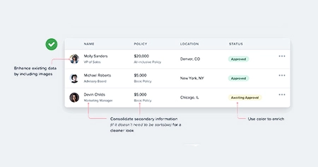
This is due to the so-called serial-position effect. It states that in a list, you are more likely to remember both the items at the beginning and the end. The middle section, on the other hand, is largely overlooked.
The takeaway here is to prioritize the most important attributes of your product or service when listing them.
7. Use faces as visual cues
People pictures provide you with a unique opportunity to direct the attention of your visitors. The well-known "you look where they look" phenomenon. They can direct the attention of visitors to other elements.
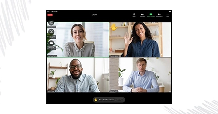
This is the famous baby face study. Visitors look at the baby when they look at the camera. Visitors look at the headline when the baby does.
8. Create meaningful subheadings
Make sure your subheads are clear. They should be useful to visitors. If your subheaders contain words like "products" or "services," consider whether a more descriptive term would be more useful.
Such modifications are beneficial to scanners and usability. It is beneficial to the visually impaired as well as accessibility. It's also good SEO practice.
9. Prioritize scrolling over clicking
So, how do you present it if you don't compress information into sliders and accordions? The solution: put everything on one long page, including the stuff that is usually tucked away. It truly works. Conversions increased by 30% as a result! That's nothing to scoff at.
Users appear to prefer scrolling over clicking. As a result, if you're currently dispersing information about your product across multiple pages, it's time to reconsider.
10.Stick to standard layouts
Google's study also discovered that "high prototypicality" correlates with perceived beauty. In other words, unusual is only sometimes attractive. A website adhering to web design standards is likelier to be liked.
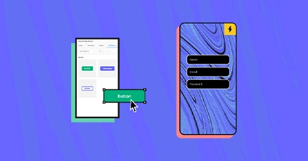
Here are the following:
- Top left logo
- Bottom social icons
- Design that is mobile responsive
11. Homepage design
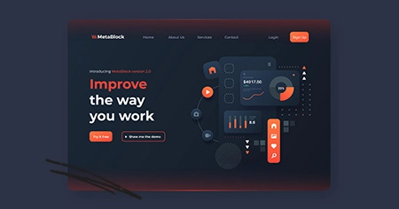
A strong homepage web design can entice visitors to explore your services more. Creating a responsive website can help your target audience learn about your company. The homepage should be tall and designed to answer your visitors' questions. The homepage should reflect the concept behind your work. The homepage menu should highlight the most important informative pages on the Website.
12. Be cautious when linking to anything on other websites
Please include links to resources that will assist the visitor in achieving their objectives. On a blog post, this is frequently a source citation or a link to external references. This post contains links to dozens of articles and studies!
Do you truly want visitors to click on that link on any page optimized to convert visitors into leads?
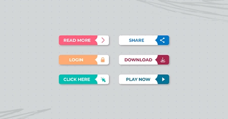
13. Highlight CTAs with Bold Colors
Every Website's goal is to persuade visitors to take a specific action. This is why we use calls to action (CTA) for engagement.
14. Typographic Hierarchy
The text-based website design Typographic hierarchy is an important aspect of Web design services. To organize it, you should start with three levels. Level one will be the largest and should emphasize content such as your brand name or tagline. Level two is used for sections or menus that group information together.

15. Be cautious when linking service pages to blog posts
If you give them a lot of reasons to leave and read your blog, they'll end up on pages that could be more focused on lead generation. Blog posts, by definition, have more distractions, exit opportunities, and lower conversion rates.
16. Avoid using carousels, sliders, tabs, and accordions
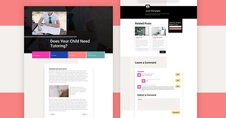
Website owners adore carousels. It's one of the most frequently requested features by customers. Unfortunately, the research indicates that they are largely ineffective.
One of the most amazing statistics comes from Notre Dame University. The webmaster noticed that the first slide on a carousel received nearly 90% clicks, while the rest were largely ignored.
Tabs and accordions suffer from the same issue as sliders and carousels: they are frequently ignored. This is exacerbated by the fact that only a small percentage of visitors read the page. Most people scan and are unlikely to click through to your content.
17. Avoid long paragraphs and lines
Long, blocky paragraphs are incompatible with digital content best practices. Easily going to break up entire paragraphs makes it easier to consume the content. As a general rule, only write paragraphs 3-4 lines long. Visitors may find it more difficult to read long lines.
18. List Order and the "Serial Position Effect"
Put the most important information in your copy at the beginning and end of any lists. Visitors scanning the page are more likely to remember the first and last items.
19. Use the Fold
The existence of the fold is a contentious issue. Some argue that the fold is no longer necessary because of the various screen sizes available nowadays. Others disagree.
However, even in 2018, people spent 57 percent of their time above the fold, sharply declining afterward. The first two screenfuls consume 74% of their time.
For your Website, this means prioritizing your content and making the most of the available space to entice users to stay. Here are some pointers:
Use a clear and descriptive headline.— Explain what your site can do for visitors and emphasize the benefits. Be succinct and use powerful words. Check out our copywriting hints for more information.
Include your main call to action— The fold is the best place to start the user journey if you want to increase conversions. Make sure your CTA is clear and visible.
Include media— Images, videos, or audio can help to emphasize your point. More visual content follows.
20. Scarcity causes "loss aversion."
Humans are inefficient cost-benefit calculators. This is true online and offline, and it explains a lot of human behavior. This fear of losing can be beneficial to web designers and copywriters. Here are some pointers:

- Costs should be grouped, while benefits should be listed separately.
- Prioritize short-term gains.
- Create urgency with limited-time offers. If the product is scarce, state so.
21. Use Hick's Law
According to Hick's Law, the more options an individual has, the longer it takes them to decide. There is a fascinating study on this phenomenon in which people were given more or fewer jam varieties to try in a supermarket. In the end, those with more options were much less likely to purchase jam than those with fewer options.
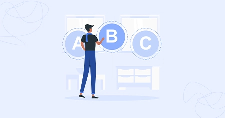
What does this have to do with your Website? Because you can increase conversions simply by restricting the options available to users. Here are some examples:
- Menu items should be reduced in number.
- Form fields should be restricted.
- Concentrate on one call to action.
- Only show social buttons for networks where you are active.
- Limit yourself to one goal per page.
22. Improve email signup forms for subscribers
If you look closely, you'll notice that it has three distinct elements. These are the three P's email signup forms.

- Prominence Within the visual hierarchy, it is visible.
- Assure It tells the reader what they will obtain and how frequently they will obtain it.
- Proof It uses social proof, such as the number of subscribers or a small testimonial.
23. Add evidence and social proof.
The human tendency to do what others do is known as "conformity bias." The mission is to make any judgment other than using your firm seem unusual.

Adding testimonials is the quickest and easiest method. Here are some other types of social proof.
- Endorsements from key influencers
- Customer feedback
- "As seen in..." logos of media outlets where your company has been mentioned.
- Social media widgets displaying the size of the following Trust seals, including association memberships, security certificates, and awards
24. Avoid using jargon. Use simple words.
Long sentences and fancy words make the temporal lobe work harder. That's not good.
Copy that works well for "low literacy" consumers works for everybody. It's not about reducing it; it's about employing simple language that anyone can recognize.
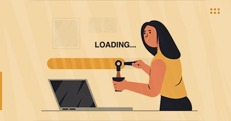
25. Website loading speed
Most users expect the Website to load in 3-4 seconds; if it takes longer, the user becomes irritated. As a result, the fundamental principle of responsive web design is to reduce the time it takes to load the homepage. The loading time should be reduced not only for desktops but also for mobile.
26. Pay Attention to the Style
The tip is to pay attention to style and use typography that perfectly matches the brand personality. Aside from that, it would help if you combined beautiful fonts with quality content to maximize the impact of your web design on target audiences.
27. Respond to the most frequently asked questions from visitors.
They came with questions. The Website's main purpose is to provide answers to those questions.
Here are the questions Joel asks to discover the most frequently asked questions by visitors:
- What prompted you to seek a solution?
- What almost prevented you from purchasing from us?
- What inspired you to give us a shot?
- What was the most important factor in your evaluation of X?
- What can you do now (or better) that you couldn't do before?
Conclusion
Web design is a complex topic that has a large impact on the success of your Website. As a result, it is essential to understand what you are doing. Using research for advice is a good way to ensure this.


