



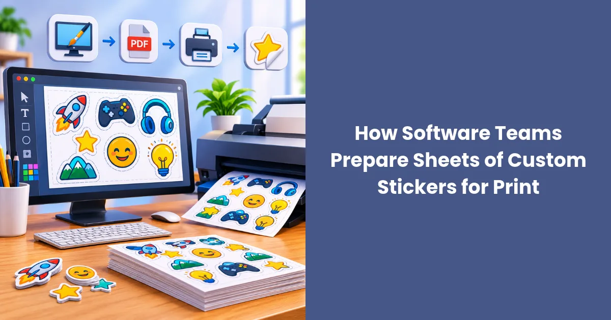
The tricky part isn’t the idea. It’s the handoff. A sticker that looks crisp in Figma can print muddy, lose its thin lines or get cut in the wrong place. This guide walks through the print prep side, written for people who are more comfortable with pull requests than press checks.
Why Sticker Sheets Suit Tech Brands
A single logo sticker does one job. A sheet can carry a small story: the company mark, a product icon, the name of a recent release, maybe a mascot holding a coffee cup. People pick the ones they like and leave the rest, which can spread a brand across more surfaces than one big decal.
Many sticker sheets are kiss-cut. The blade cuts through the sticker layer but not the backing liner, so every design stays on one sheet until someone peels it off. That makes sheets easy to drop into a welcome box, mail with a swag order or stack on a booth table without loose pieces sliding everywhere.
Sheets also fit the way software teams already think. You’re shipping a set of components, not one asset. That framing helps a lot once you start designing.
Treat the Sheet Like a Small Design System
If your team has a design system, you already have most of what a sticker sheet needs. Pull colors from your existing tokens. Reuse icon styles, corner radii and stroke weights so the stickers look like they belong to the same product family.
A practical structure is one hero design plus several supporting pieces. The hero might be your logo or mascot at the largest size. The supporting stickers can be smaller: a product icon, a short tagline, a command-line joke your users will get. Deciding the hierarchy early also gives whoever approves the order a clear picture of what matters most on the sheet.
Don’t try to cram everything in. Sheet size limits how many designs fit, and spacing between them matters for cutting (more on that below). The number of designs that fit on a 4 x 6 inch sheet depends on their dimensions, cut shapes and required spacing. Sketch the layout at actual size before deciding how many stickers to include.
A few questions worth answering before anyone opens a design file:
- Who receives the sheet: new hires, customers, conference visitors or open-source contributors?
- Which single design should stand out if someone only keeps one?
- Does any sticker reference a feature name or release that might change soon?
That last one trips teams up. A sticker for a beta codename can feel dated within months, so keep time-sensitive jokes to one slot rather than the whole sheet.
Get the File Format Right Before Anyone Says “Ship It”
Here’s where most problems start. Screens and printers handle images differently, and files built for a website often aren’t ready for a press.
Start With Vectors, Use Raster Only When Needed
Logos, icons and type should stay in vector formats (AI, EPS, SVG exported to PDF) whenever possible. Vectors scale without losing sharpness, which matters when one design appears at two different sizes on the same sheet.
Photos and textured illustrations are raster by nature. For those, build the file at the final print size and at a high enough resolution for print. Printers often ask for 300 dpi at 100% scale, so a 2-inch sticker needs at least 600 pixels across. Upscaling a small PNG afterward won’t add detail that was never there.
Color Mode and Print-Ready PDFs
Screens mix light in RGB. Many print processes use CMYK inks. Some bright screen colors, especially electric blues and neon greens common in tech branding, may shift when converted, so preview the CMYK version before you approve anything.
Print-oriented PDF standards such as PDF/X can help preserve key production information, including font handling and page geometry. Requirements differ by PDF/X version and printer, so check the vendor’s accepted formats before exporting. A properly prepared AI or EPS file may work just as well.
Vendor requirements still win. When you’re ordering sheets of custom stickers, Stickerbeat’s product page, for example, recommends CMYK artwork at 300 dpi scaled to 100% and accepts EPS, AI, TIF, JPG, PSD, PNG and PDF files up to 20MB. Reading that spec before the design starts beats reformatting files the night before an event.
Design for Small Sizes and Real Contrast
Stickers are small, and people look at them from across a desk or a room. Fine detail that reads well on a 27-inch monitor can disappear at an inch and a half.
Contrast is a good place to start. Web designers may recognize the W3C’s WCAG contrast guidance, which recommends a ratio of at least 4.5:1 for normal text and 3:1 for large text. These are web accessibility thresholds, not sticker printing standards, but they offer a useful starting point for thinking about legibility. Always test the design at its intended printed size.
The reasoning behind them carries over, though: people with low vision often struggle to read text that doesn’t contrast with its background, and a sticker on a busy laptop lid doesn’t get a long look.
A few habits help small designs hold up:
- Keep stroke weights thick enough to survive scaling down.
- Avoid tiny type on the supporting stickers. A one-word label often works better than a full tagline.
- Check light designs against both light and dark surfaces, since you can’t control where people stick them.
- Print a test page at actual size on an office printer. It won’t match the final colors, but it shows whether details are readable.
Finish choice matters a little here too. Matte finishes cut down on glare, while gloss tends to make colors look more saturated. Neither is wrong. It depends on whether readability or punch matters more for your designs.
Cut Lines, Spacing and the Proof
Each sticker needs a defined cut path so the printer knows where to trim. Some printers ask designers to supply these paths, while others generate them from the uploaded artwork. In the latter case, customers can review the automatically generated cut lines during digital proofing. Either way, give each design enough breathing room that the blade can follow its outline without clipping artwork.
Spacing requirements vary by printer. One sticker printer requires 0.15 inches between individual stickers and 0.25 inches of clearance from the sheet edges. Check the requirements for your chosen material and layout before finalizing the file.
Tiny or highly detailed shapes are harder to cut cleanly. Printers may ask for a larger minimum size or more spacing on designs like these, so expect some feedback if your sheet is packed tight.
Then comes the proof. Think of it as a code review for print. The printer sends back a layout showing placement, spacing and cut lines, and you approve it or request changes. This is the last cheap moment to catch problems, so slow down:
- Zoom in on every cut line. Does it follow the shape or slice through a character’s hand?
- Check text for typos at full size. Release names and URLs are common trouble spots.
- Confirm the sheet size and sticker count match what you ordered.
- Look at color notes or warnings from the printer and decide whether to adjust.
Get another reviewer if you can. Someone who didn’t design the stickers will spot things the designer’s eyes slide past.
Plan Quantities Around How You’ll Use Them
Sticker orders often get sized by gut feeling. A bit of planning avoids boxes of leftovers in a storage closet.
Start with known numbers. How many people will you hire this year? How many events are on the calendar, and roughly how many visitors does your booth usually see? Customer swag orders and community programs add more, but they’re harder to predict, so treat them as a buffer rather than a baseline.
Many printers sell sheets in tiers, with lower unit prices at higher quantities. That makes it tempting to overorder. If your sheet includes a release name or a dated joke, a smaller run you can reorder later may be the safer choice. Evergreen designs, like the logo and mascot, hold up better in larger runs.
Storage is worth a thought as well. Sheets often arrive bundled, so keep them flat and dry until they’re handed out. Curled or crushed sheets look careless in a welcome kit.
A Short Pre-Order Checklist
Before you hit submit, run through the basics:
- Designs pulled from your current brand colors and icon set
- Vector files for logos, icons and type
- Raster images built at final size and the printer’s requested resolution
- Colors previewed in CMYK
- Fonts embedded or converted to outlines
- Contrast checked at actual print size
- Cut lines supplied or requested, with spacing between designs
- Proof reviewed by at least two people
Sticker sheets are a small project, but they carry your brand onto laptops, water bottles and notebooks long after the event ends. Treat the file prep with the same care you’d give a production deploy, and the printed result is far more likely to look the way it did on screen.


