


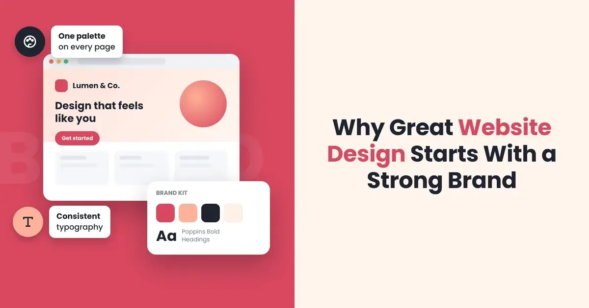
Start with the brand instead. Clear decisions about who you serve, what you promise and how you express it give the website’s content and structure a purpose before detailed design begins.
Turn your brand into a practical website brief
Start with five things: the intended audience, their main task, your offer, supporting evidence and the next action you want them to take. A logo and colour palette help with presentation; these answers tell a designer what the page needs to communicate.
A shared brief connects brand strategy, visual identity and digital design, the disciplines brought together in Klutch Studio’s work.
Consider a hypothetical office-cleaning business promising clear service scope and predictable scheduling. “Look professional” gives its designer little direction. “Help office managers understand what is included, how cleaning fits around working hours and how to request a quotation” establishes priorities the design can support, even without an extensive brand manual.
Let visitor priorities shape the page
For this business, “Office cleaning planned around your working day” would make a more informative headline than “A fresh approach”. It gives the design a specific message to emphasise and sets an expectation: the content below should explain how that scheduling works.
Arrange the page around the visitor’s likely questions. What spaces and tasks are covered? Can cleaning happen outside office hours? How is a quotation prepared? A sample cleaning schedule could make the offer tangible, while clearly stated exclusions would help visitors judge whether the service suits them.
Sketch that order in a wireframe, a basic plan of page structure and content placement. Use draft copy instead of placeholder text. Real headings and explanations reveal how much room the information needs, so the layout can accommodate it.
Navigation has a separate job: helping visitors reach the right information. “Services” or “Cleaning schedules” offers a clearer route here than an ambiguous label such as “Our world”.
Give visual choices a job to do
Visual identity provides a coherent way to present the information. Use typography to separate the main promise from supporting detail, spacing to distinguish service options and consistent button styling to make the next action recognisable. Each choice should help someone read, compare or act.
Photographs of the cleaning work and relevant office environments would support the explanation better than unrelated lifestyle imagery. Images presented as examples of the company’s work must show work it actually carried out.
Use the colour palette selectively. Check that text is easy to distinguish from its background, including on buttons, and keep elaborate typefaces where they remain readable. For long service descriptions, prioritise readability over decorative flair.
On a phone, adapt the arrangement while preserving the priorities. Keep headings close to the information they introduce, and check that images support the reading sequence as the layout changes.
Carry the promise into everyday interactions
A promise of clarity extends to the enquiry process. The cleaning company’s initial form might ask for location, approximate office size and preferred cleaning times. Collect the details needed to begin the conversation, leaving a full specification for the appropriate stage.
Button wording should match the process. “Request a quotation” fits a service that requires an assessment before a price is confirmed. Reserve “Book now” for a journey that actually lets visitors confirm a booking.
After submission, confirm that the enquiry has been received and explain what happens next. Error messages should identify the problem and help the visitor correct it. A friendly brand voice belongs here too, with clear instructions taking priority over jokes or vague reassurance.
Test the design against real tasks
Ask someone unfamiliar with the business to explain the offer, find what is included and start an enquiry. Watch where they hesitate. An overlooked service detail or misunderstood button gives you something specific to investigate: wording, position or visual emphasis.
Repeat the journey on a phone and using only a keyboard. Check that controls can be reached, the current keyboard focus is visible and form fields have clear labels. These are starting checks, not a complete accessibility assessment.
Judge the finished website by how clearly its content, layout and interactions fulfil the brand promise, as well as how it looks.