No matter how good your online advertisements are, you may lose valuable customers if your online store is not optimized for sales.
You may also be wasting valuable ad dollars if visitors leave your site as soon as they arrive. And, of course, you should work on your e-commerce website, as it is predicted that by 2040, 95% of all purchases will be made online.
In this article, we will explain 23 e-commerce web design tips, and you should start to see more sales in no time!
Here are the following 23 Tips for Ecommerce Web Design That Boost You Sales to take your e-commerce website from 0 to Hero:
1. Use a simple design
What do you want a site visitor to do when they arrive? They make it simple by employing a straightforward design with clear navigation and minimal clutter. Consider what your visitor sees first. They won't stay long if it's an advertisement, a selection of everything you've ever sold, or something equally distracting. Shoppers should be directed to your core products, a clear value proposition, or a CTA (call to action) that stands out from the rest of the page.
Your visitors will want to navigate to the section of your website that is most relevant to them. Make it simple by clearly structuring your navigation menu and categorizing products into broad categories. Please don't overdo it.
2. Keep the user in mind
Every aspect of your e-commerce web design, from product pages to product images and contact forms to the checkout page may influence a user's decision to buy. Therefore, as much as possible, your store front should make a good first impression.
That is why, when designing your e-commerce website, you must
always keep the user in mind.
Other simple design elements include:
- Easily scannable content
- Fonts that are simple and legible
- Consistent color schemes
- Navigation elements that are easily identified
- Product categories are easily navigable.
3. Use color and images to your advantage
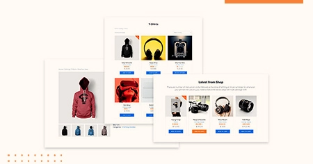
High-quality images are an excellent way to highlight your products on a website with a straightforward design—let the images speak for themselves. For example, a close-up shot of a Swarovski necklace can showcase its intricate details and sparkling appeal, making it more enticing to customers. They capture the attention of the customer and pique their interest.
Images boost conversion by up to 40%, so they must be prominently displayed. Customers want to know exactly what they're getting and see it from as many perspectives as possible before purchasing. Clean, professional product photography builds trust.
Using color psychology in your e-commerce website design may also nudge customers. Conversions can be influenced by everything from the color of your background to the shade of your buttons.
Tone: Consider your brand's tone, which could be anything
from whimsical to serious to quirky.
Value: Sleek blacks and gleaming golds can be used to
convey luxury.
Period: Some colors have a vintage or futuristic vibe to
them.
4. Add a 'Contact Us page'
More frequently than not, there is no contact information on the website. So, how are you going to get in touch with those websites? The same could happen to you.
As a result, providing contact information or an email address is critical; otherwise, your audience or clients will not be able to interact with you. You are also passing up many opportunities.
What is the point of creating an outstanding e-commerce web design if this is the case? First, create a clear page with your contact information.
For example, as shown in the image, we have also provided a simple page with various platforms through which you can contact us.
5. Be open and honest about pricing
The best policy is always to be honest. Always be upfront and honest about the prices of the products or services you sell when designing your e-commerce website. Don't try to hide or make information difficult to find on your website.

You never want your website visitors to feel misled or tricked. For example, burying pricing information on obscure website pages can be harmful. Instead, make it easy to find and understand. This rule also holds for shipping.
6. Make it easy to navigate
Navigation is often an area where users become confused and choose to abandon a site. Finding what a user needs can be a daunting task with poor navigation, especially when a site offers a wide variety of products (e.g., Walmart).
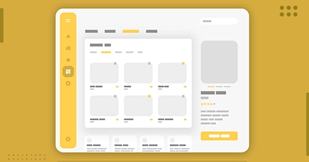
You can greatly improve the user experience you provide by keeping your menu clear and organized and using jargon that your customers are familiar with (e.g., "Main Menu," "Apparrel," etc.). Similarly, ensure that your product pages are well-organized, as you don't want your users to get lost when they're almost there.
7. Select a trustworthy web hosting service
Google is unlikely to rank your slow website; even if it does, the slower your website is, the more likely potential customers will click away. One in every four website visitors will abandon a website that takes more than four seconds to load, according to Loadstorm and Econsultancy.
Unreliable web hosting services will slow down your site and may cause additional issues. Ensure you find a reliable host with excellent customer service, more than 99% uptime (which means it will not crash), and no speed issues.
8. Make your website mobile-friendly and fast
We're all aware that more people are br the website on their smartphones than ever before. Some people no longer own computers or laptops, relying solely on their smartphones for internet access. In addition, younger customers, particularly those in the Gen Z age group, browse on mobile. With Gen Z vs Gen Alpha, the shift towards mobile-first experiences is even more pronounced, as Gen Alpha grows up entirely in a digital world, expecting seamless, fast, and highly interactive mobile experiences.

You'll lose sales if your site is clumsy or doesn't load on mobile. In addition, people will grow tired of it and move on to another website. When your site loads, it should adjust to the size of the smartphone screen, and all images should load properly.
Your site should also load quickly. People will pass judgment on your site and possibly your brand if your page is slow. You've already lost 25% of your viewers by the time your page takes 4 seconds to load.
9. Social Proof in Design On My Mind
Too many e-commerce Web Design owners know how much time they have spent researching or developing their product, and they assume that everyone else is as well. On the other hand, people have no idea how good it is, how to use it, or why they should choose your product over others. Here's where social proof comes into play. Robben Media CEO Brain Robben explains how a social-proof-oriented site can help boost sales.
10. Include testimonials and reviews
Before purchasing a product, 61% of online shoppers read customer reviews. You can take advantage of this useful statistic by including reviews and testimonials on your website.
Customer reviews are a simple and effective way to boost sales
and conversions.
Product-specific reviews can be included directly under each
product's description, which is an effective e-commerce web
design strategy. If you don't have a lot of different products,
you can also have a completely separate page on your website for
reviews and testimonials.
11. Search for an option
As previously stated, even a well-organized web design will fall short when navigation is difficult to use (think Amazon). This could explain why "densely packed retail websites had higher [rates of] search (>50%)" (measuring) because search is often the more accessible option for finding a product on such sites.
While not every website will benefit from a search tool, consider whether your users will become disoriented if you do not provide one. Furthermore, if you believe a search tool would be useful, make sure that it is visible to your users and not hidden within the navigation: the easier it is to find.
12. Make registration optional
Forced account registration ranks even higher on the list of reasons for shopping cart abandonment. According to Baymard's research, 24% of US adults say they didn't buy something because the site required them to create an account.
"One of the most common mistakes Ecommerce Web Design make is limiting customers' ability to place orders without having an account. Of course, some stores and businesses require an account; in those cases, you should implement a quick SSO login (single sign-on) functionality using Google, Facebook, LinkedIn, or a similar service."
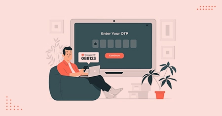
The best practice for an e-commerce web design is encouraging rather than forcing account registration. Remind your customer that creating an account will significantly speed up the checkout process and that you can offer incentives such as weekly deals or free shipping.
13. Ensure Security and Privacy
Check that an SSL certificate is installed to encrypt the data that comes and goes to the browser. Also, have a simple privacy policy that informs your customers about how your website and company use their information.
Therefore, the information in your e-commerce store's Privacy Policy should be comprehensive but presented in plain English so the average site visitor understands your rules and rights.
The following information should be included in your privacy policy:
- What information does your online store collect, directly and indirectly?
- What information do you think you'll acquire in the future?
- The methods you use to collect, manage, and distribute client information
- Potential future scenarios for using consumer data
- How third-party services such as Google Analytics, AdSense, and others may collect and process data from your customers.
14. Limit Your Product Options
In the world of e-commerce Web Design, a fascinating paradox exists. The more options shoppers have, the less frequently they purchase. Therefore, your website should have a wide range of products, but the design should only allow the shopper to see 3-4 at a time.
15. Grid layouts
Grid layouts are ideal for Ecommerce Web Design and most websites in general. It's best to keep products organized in rows and columns when browsing them. Just don't cram too many different products into one row.

We recommend having three or four products per row to make your product catalog pages visually appealing. In addition, leaving plenty of white space around each item allows people to breathe and distinguish between products.
16. Make the purpose of each page clear
Although we mentioned it briefly earlier, it's important to
remember that when a user visits your site, you won't be present
to show them how it works, where to find a product, or how to
place an order. As a result, your website must speak for itself
and provide clear calls to action.
Businesses often become so preoccupied with creating pages with
calls to action that they overburden their users.
17. Improve your SEO
Nearly 20% of European and one-third of US consumers start their online product search with a search engine like Google, making search engine optimization (SEO) for your e-commerce Web Design essential.
If you aren't ranking, you will fall behind your competitors who are. It isn't easy to reach the top, but it is possible with keyword research, optimized website pages, internal links, and external backlinks. Go local for a better chance of success. Concentrate your SEO efforts on your country, region, or even town.
Since earning high-quality backlinks requires outreach and strategic planning, many businesses turn to link-building experts like Outreach Monks to streamline the process.
18. Add Payment Icons
E-commerce web design serves customers from all over the world, and each has a preferred payment method. Furthermore, a payment method or option may have technical limitations, so it is best to clarify these options.
Additionally, avoid additional charges during the purchase. Including shipping and tax information during the checkout process makes pricing details more accessible.
However, if you include any surprises or different prices after you've selected a product, you risk losing customers.
19. Make use of Google Lighthouse Tools
It can assist developers and non-developers in determining the usability of their websites. These tools assisted Phil Strazzulla of Select Software in making improvements that significantly improved his website's performance. "While everyone should use these tools, they are especially useful for e-commerce businesses, where ease of use directly correlates with conversion rates."
20. Consistent branding
While optimizing your website using popular e-commerce web design conventions is wise, you also want your site to stand out.
Standing out is simple when your branding is consistent across all website pages! Ensure your logo is visible on every website page and that your color schemes and fonts are consistent and on brand. Businesses can further enhance their visual branding by exploring tools like add logo to photo to create consistent and professional imagery across different platforms.
Nobody enjoys clicking on a website's page only to find themselves on a completely different website. Using the same navigation menu and design scheme on all pages creates a consistent and trustworthy image.
21. Publish blog articles regularly
People don't just look for products on search engines. Creating informative and entertaining blogs about your products and industry will aid in brand recognition. Using the proper SEO on those blogs will assist you in reaching the top of Google.
Remember that most people will not buy from you daily but may be interested in the subject. You might even get them to skip searching on Amazon or Google if you're their guide and have links to your Ecommerce Web Design for when they're looking to buy.
22. Provide a variety of contact options
A live chat is great (of course), but SDK Marketing's Simon Dwight recommends going a step further and providing your online visitors with a multi-channel contact option.
Keep in mind that many customers are just searching but are ready to convert with a little assistance. They'll buy from whoever can answer their question satisfactorily as soon as possible."
23. FAQ Page
Tired of constantly responding to customer inquiries? Including
a FAQ page in your website's navigation menu not only helps to
reduce the volume of product inquiries.
How do FAQ pages foster trust? First, they demonstrate to your
visitors that you are making an effort to be open and honest
about your products and services. They also show you are serious
about answering questions and have good customer service
skills.

Increasing potential customers' trust that you fully
understand your product.
FAQ pages can also improve site navigation by including
hyperlinks to relevant pages on your website.


